Building Depth with Mixed Media and Found Paper

Most people think you need expensive, heavy-weight watercolor paper to create depth in a mixed media piece. They assume that if the surface isn't thick or primed, the layers will simply fall apart or buckle. That's actually a mistake. You can achieve incredible structural depth using lightweight found paper—old book pages, vintage maps, or even brown paper grocery bags—provided you understand how to layer textures without overwhelming the base. This post covers the mechanics of layering paper with acrylics and ink to create a sense of physical and visual weight.
When you work with found paper, you aren't just adding a layer; you're adding a history to the work. The way a faded text looks beneath a wash of transparent ink creates a sense of time. It isn't about making a "perfect" surface. It's about using the existing patterns of the paper to do the heavy lifting for you. If you're looking to experiment with different surfaces, check out the Getty Conservation Institute for insights on how different materials react to various media over time.
Can I use any old paper for mixed media?
Not every paper is a winner, but you don't need professional-grade sketchbook pages to start. The main thing to watch for is the way the paper reacts to moisture. If you're using a heavy wash of acrylic or a lot of water, thin newsprint might turn into pulp. If you want to use something like a newspaper, try a light coat of matte medium first. This acts as a barrier that keeps the fibers from disintegrating when you apply wet paint. You'll find that even a simple brown paper bag can handle quite a bit of pressure if you treat it with a bit of respect.
Here's a quick breakdown of how different papers behave:
- Newsprint: Highly absorbent, dries fast, but fragile when wet.
- Vintage Book Pages: Great for texture, usually more stable than newsprint.
- Brown Paper Bags: Tougher, takes heavy acrylics well, adds a warm base tone.
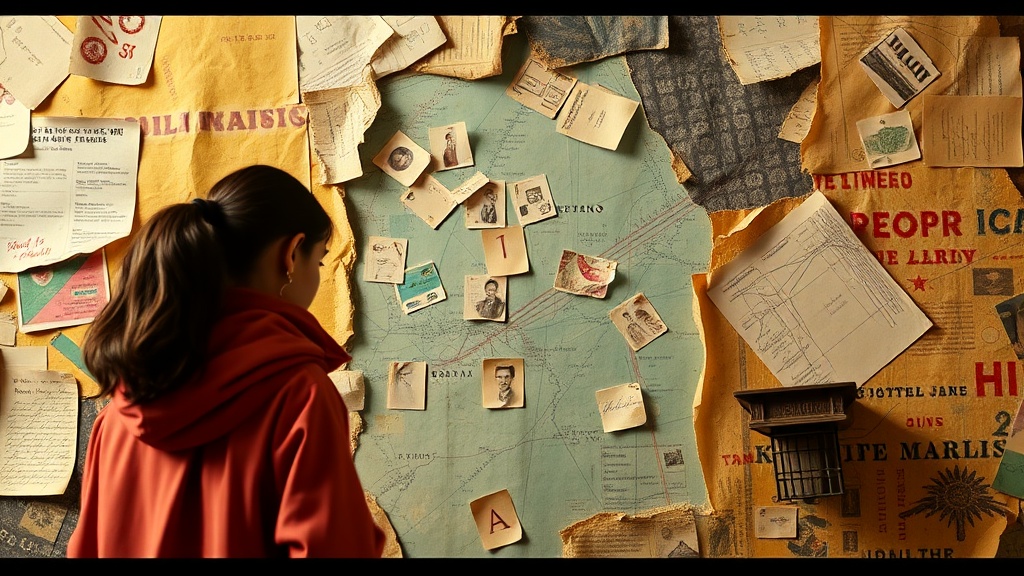
- Map Paper: Excellent for layering subtle information under paint.
How do I prevent my layers from looking messy?
The biggest trap in mixed media is the "muddy" look. This happens when you layer too many opaque colors on top of each other without enough breathing room. Instead of thinking in terms of color, think in terms of transparency. If you've applied a piece of a vintage map, don't just paint over it with a solid block of blue. Use a transparent glaze or a watered-down ink. This allows the text or the map's lines to peek through, which creates that sense of dimensional space. If you find yourself getting stuck, look at the Met Museum's collection of prints to see how varying levels of opacity create depth in classical works.
One trick I use is the "dry brush" method. After you've applied a base layer of paper and let it dry completely, take a brush with very little paint on it and skim the surface. This hits the raised edges of the paper texture and leaves the valleys empty. It highlights the physical topography of your collage. It's a small move, but it makes a massive difference in how the viewer perceives the surface.
What supplies do I need for paper layering?
You don't need a studio full of gear. In fact, a minimalist approach often works better because it keeps your focus on the paper's character. You'll want a few specific items to keep the pieces in place and build the texture. A good adhesive is the foundation of any successful piece. I usually reach for a matte medium or a high-quality gel medium. Avoid standard glue sticks; they tend to peel or leave a residue that ruins the finish.
To build up the physical texture, consider these tools:
- Brayers: These are wonderful for smoothing out the paper so you don't get air bubbles under your collage pieces.
- Gesso: If your paper is too thin, a thin layer of gesso can provide a much-needed surface to paint on.
- Stencils: These can help you repeat patterns across your paper layers without using too much paint.
When you're working, remember that the order of operations matters. If you put your paper down last, it's just a sticker on top. If you put it down first and paint over it, it becomes part of the artwork. This distinction is where the real magic happens. You're not just sticking things down; you're building a world. Try starting with your heaviest textures first, then layering your lighter, more transparent elements on top. This ensures the composition feels grounded rather than cluttered.
Don't be afraid to get a bit messy. The beauty of working with found paper is that the "mistakes" often become the most interesting parts of the piece. A tear in the edge of a page or a smudge of ink can add a sense of authenticity that a perfect, clean edge simply can't provide. Keep experimenting with how the light hits the different textures you've built up. That's where the depth truly lives.