Master Wet-on-Wet Watercolor Techniques for Dreamy Landscapes

This post covers the specific wet-on-wet watercolor techniques that transform flat washes into atmospheric, dreamy landscapes—from timing your paper saturation to controlling pigment diffusion. Whether painting misty forests or sun-drenched meadows, these methods create the soft edges and luminous layers that make watercolor sing.
What Is Wet-on-Wet Watercolor and Why Does It Matter?
Wet-on-wet watercolor is a technique where paint is applied to damp paper instead of dry, allowing pigments to flow and blend organically. The result? Soft edges, spontaneous blooms, and atmospheric effects that simply cannot be achieved through dry brushwork.
Here's the thing—most beginners struggle because they treat wet-on-wet like wet-on-dry. They load the brush the same way. They expect the same control. They get frustrated when colors muddy or pool in unexpected places.
The reality is that wet-on-wet demands a different mindset. You're not commanding the pigment; you're guiding it. Water does the heavy lifting. Your job is understanding when the paper is too wet (paint runs everywhere) versus when it's just right (pigment settles with soft, diffused edges).
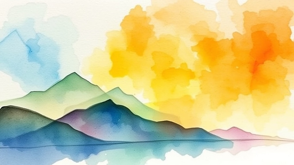
Professional watercolorists like Jean Heyman have built entire careers on mastering this technique. The approach works particularly well for landscapes because nature rarely has hard edges—think of distant hills dissolving into fog or reflections rippling across still water.
What Supplies Do You Need for Wet-on-Wet Landscapes?
The short answer: quality 100% cotton paper, a large hake brush for wetting, and fresh tube paints. You don't need everything on the market, but skimping on paper is a recipe for disappointment.
Cellulose (wood pulp) paper—the stuff in student pads—buckles under heavy water loads. Pigments sit on the surface instead of absorbing properly. For wet-on-wet work, spend your money on paper first.
| Supply | Recommended Option | Budget Alternative |
|---|---|---|
| Watercolor Paper (cold press) | Arches 140lb Cold Press (100% cotton) | Canson Heritage Cold Press |
| Wetting Brush | Princeton Neptune Hake Brush (2-inch) | Wash brush from local art store |
| Pigments | Winsor & Newton Professional Tubes | Daniel Smith Essentials Set |
| Palette | John Pike Big Well Palette | Ceramic dinner plate (white) |
| Board | Gatorfoam board (cut to size) | Masonite panel from hardware store |
The catch? Even the best paper won't save you if your water is dirty. Change it often—cloudy water muddies colors faster than anything else.
For brushes, a 2-inch hake brush (synthetic or natural) makes wetting large sheets effortless. Some painters prefer spray bottles, but brushes give you more control over saturation levels across the surface.
How Do You Time the Wetness for Maximum Control?
Timing is everything—paint when the paper has a subtle sheen but no standing water. Too wet, and pigments race to the edges creating "cauliflowers" (unwanted blooms). Too dry, and you've lost the effect entirely.
Most beginners wet the paper and immediately start painting. Wait. The surface needs to settle from "soaking" to "moist." Here's how to read it:
- Too wet: Water pools when you tilt the paper. Wait 30-60 seconds.
- Perfect: Gentle sheen, paper feels cool, brush glides without dragging.
- Too dry: No sheen, brush stutters across surface. Mist lightly and wait again.
Worth noting—humidity changes everything. In Portland's damp winters, paper stays wet longer. Arid climates (Arizona, Nevada) demand faster work or frequent misting. Adjust accordingly.
Some painters use the "touch test"—lightly pressing a clean finger to the paper. If it comes away dry, you're too late. If water beads on your finger, too soon. Cool and slightly tacky? Perfect.
What Are the Core Wet-on-Wet Techniques?
Master these four approaches and you can paint virtually any landscape element.
The Charging Method
Load your brush with pigment and touch it to the wet paper. The paint spreads until it hits drier areas or runs out of water. This creates soft, blooming shapes perfect for distant trees, clouds, or mist.
Work from light to dark. Watercolor is transparent—once you go dark, you cannot go back. Build layers gradually, letting each wash dry slightly before adding the next.
The Lifting Technique
While paint is still damp (not soaking), lift color with a dry brush, paper towel, or thirsty brush. This creates highlights, sunlit areas, or fog effects. The damp paper holds less pigment than fully wet, giving you more control over the lifted shape.
Natural sea sponges work beautifully for lifting irregular, organic shapes—think rocky outcrops or cloud edges. Synthetic sponges leave uniform patterns that look artificial.
The Dropping/Blending Method
Drop one color into another while both are wet. The pigments merge at the boundary, creating smooth gradations. This technique excels at sunset skies, water reflections, and atmospheric perspective.
The trick? Use colors with similar wetness and pigment density. Heavy pigments (like French Ultramarine) drop into lighter ones (like Quinacridone Gold) more aggressively than the reverse. Plan for this.
Controlled Blooms (Cauliflowers)
Usually considered mistakes, blooms can be weapons in the right hands. Add more concentrated pigment or clean water to a damp wash. The disruption creates organic, fractal-like patterns—ideal for foliage texture, coral, or abstract backgrounds.
Practice this on scrap paper first. There's a narrow window between "controlled texture" and "complete chaos."
How Do You Fix Common Wet-on-Wet Mistakes?
Muddy colors, hard edges where you wanted soft, and overworked areas plague every beginner. Here's how to handle each.
Muddy Colors: This happens when too many pigments mix on the paper. Stick to three colors or fewer per wash. Let layers dry completely between color changes. (The temptation to "fix" things immediately is strong—resist it.)
Unwanted Hard Edges: These form when paint dries on part of the wash while you're still working. Work faster, use more water, or paint smaller sections. A light misting can reactivate edges before they set completely.
Overworking: Wet-on-wet has a lifespan. After three or four pigment applications, the paper becomes saturated and colors turn gray. Know when to stop. That said, a "ruined" wash can become an underpainting—glaze over it once dry.
"Watercolor is the only medium where the white paper is your white paint. Every other medium adds light; watercolor subtracts darkness. Wet-on-wet magnifies this—you're painting with water as much as pigment."
What Are the Best Pigments for Atmospheric Landscapes?
Not all watercolors behave the same on wet paper. Granulating pigments (those with larger particles) settle into paper texture, creating interesting speckled effects. Smooth pigments flow evenly.
For dreamy skies and misty mountains, consider these specific colors:
- Cerulean Blue (Chromium): Granulates beautifully for sky washes. Try the Winsor & Newton version.
- Quinacridone Gold: Transparent, warm, perfect for autumn foliage and sunlit areas.
- French Ultramarine: Deep, granulating blue for shadows and distant hills.
- Perylene Green: Dark, transparent, excellent for forest depths without looking cartoonish.
- Opera Pink (or Quinacridone Magenta): Vibrant, staining, gorgeous for sunset glows.
Avoid opaque colors like Cadmium Yellow or Chinese White for wet-on-wet work. They muddy quickly and defeat the transparency that makes watercolor luminous.
How Do You Build a Complete Wet-on-Wet Landscape?
Start simple. A basic three-layer approach works for most scenes:
Layer One—The Sky and Background: Wet the entire paper. Drop in sky colors while tilting the board to create soft gradations. Add distant hills while still wet—they'll fade naturally. Let this dry completely (or nearly so) before proceeding.
Layer Two—Midground Elements: Rewet selectively—perhaps just the lower two-thirds for trees and land. Paint middle-distance elements. These will have softer edges than foreground but more definition than background hills.
Layer Three—Details and Accents: Paint foreground elements on dry or slightly damp paper. Add texture with dry brush techniques. Splatter paint for foliage texture. Darken focal points.
The watercolor paper you choose matters here. Arches 140lb cold press handles multiple wet layers without deteriorating—cheaper papers pill or tear after repeated wetting.
Here's the thing about "dreamy"—it doesn't mean sloppy. The best wet-on-wet paintings have deliberate structure beneath the softness. Know where your focal point sits. Plan your values (light, medium, dark) before touching brush to paper.
Practice the timing. Practice reading paper wetness. Practice patience between layers. The medium rewards those who work with it rather than against it—wet-on-wet isn't about controlling every edge; it's about orchestrating happy accidents into cohesive landscapes that feel alive.
Steps
- 1
Prepare Your Paper and Apply the First Water Wash
- 2
Mix and Apply Colors While the Paper is Still Wet
- 3
Control the Blend and Let Your Painting Dry Naturally